Weather Clock is an interactive digital artwork that emphasises the importance of coexistence between humans and nature in the face of the climate crisis.
It transforms London’s weather data (1979-2020) into geometrical shapes, representing temperature, sunlight, and rainfall by using the balanced movement of digital pendulum, which is a principle of pendulum art.
Each shape creatively interprets weather patterns, highlighting the need for ecological harmony.
Design Disciplines
Interaction Design/ Data Visualisation
Skills
Figma/ Adobe Illustrator
Weather Clock

Weather Clock
Weather Clock is an interactive digital artwork that emphasises the importance of coexistence between humans and nature in the face of the climate crisis.
It transforms London’s weather data (1979-2020) into geometrical shapes, representing temperature, sunlight, and rainfall by using the balanced movement of digital pendulum, which is a principle of pendulum art.
Each shape creatively interprets weather patterns, highlighting the need for ecological harmony.
Design Disciplines
Interaction Design/ Data Visualisation
Skills
Figma/ Adobe Illustrator
Data Analysis
I’ve categorised London weather data into three groups: temperature, sun, and rain, which include parameters like temperature extremes, cloud cover, sunshine, global radiation, precipitation, and pressure.
Each parameter generates unique shapes inspired by pendulum art using a digital formula, creating an intuitive visual summary of daily weather conditions.


Visual Experience
The logo serves as the core of the visual identity, inspired by weather shapes in data visualisation and harmonography. It embodies the key concepts of circulation and roundness, creating an experience that feels organic and cohesive.
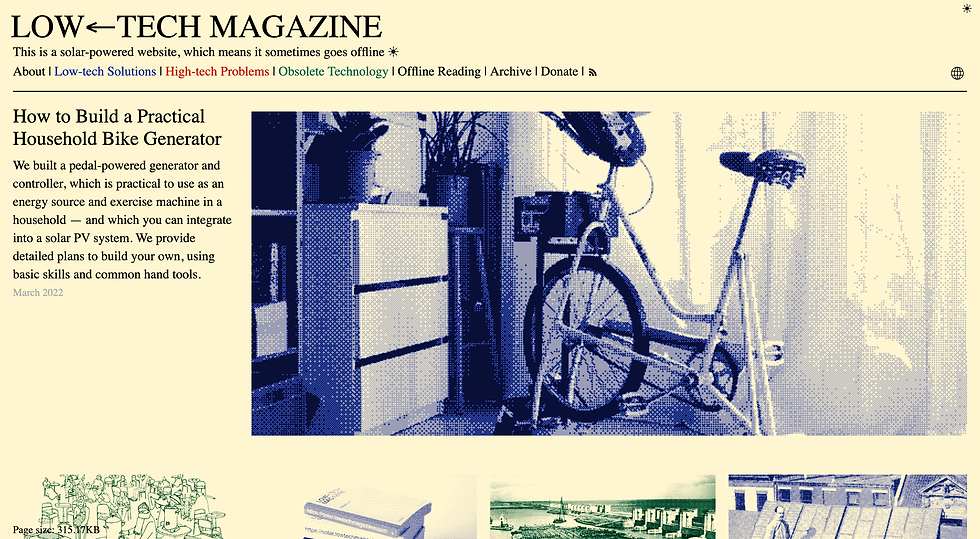
To align with sustainable design values, the colour palette is influenced by the early stages of the website and The solar-powered Low Tech Magazine.
Visual Experience
The logo serves as the core of the visual identity, inspired by weather shapes in data visualisation and harmonography. It embodies the key concepts of circulation and roundness, creating an experience that feels organic and cohesive.
To align with sustainable design values, the colour palette is influenced by the early stages of the website and The solar-powered Low Tech Magazine.


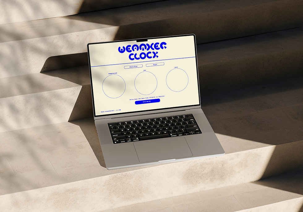
Interface Design
Guided by sustainable design principles, the interface prioritises simplicity to minimise energy use. It features three circles representing weather shapes and three buttons for interaction.
At the bottom of the website, it displays data transfer amounts to highlight its environmental impact.
I created the visual elements in Illustrator and communicated with a developer on Figma.